Is hurricane activity changing over time? And if so, why? We introduce a publicly available dataset to try and shed some light on this question...
James McIlwaine FIA
Chief Product Officer
Introduction: The IBTrACS Dataset
The old adage “There is no such thing as a free lunch” rings true in many areas, and natural catastrophe risk is no exception. Faced with a problem as intractable and complex as modelling catastrophes effectively, data is a valuable commodity, with its collection and analysis being a key tool in developing our understanding. But where are we to look when the data we need to answer these questions is so hard to come by, and so often prohibitively expensive where it is available?
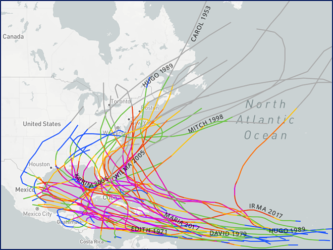
The main purpose of this post is to give a brief demonstration of the power of one of the rare publicly available sources at our disposal: The International Best Track Archive for Climate Stewardship (IBTrACS)[1]. IBTrACS is a worldwide tropical cyclone dataset that contains information on storm activity going back over 150 years for some regions[2]. The data is compiled by a range of meteorological agencies and records information on tracks, wind speeds and landfalls. The figure below[3] provides an example of the types of analyses that can be performed with this data:
Fig. 1 Screenshot from the NOAA website illustrating all storms in the basin to have reached category 5 (denoted by purple track colouring) since records began. This exhibit is fed by IBTrACS data.
There are any number of questions to explore with this data. This post will be a relatively high-level introduction looking into how hurricane frequency patterns have developed over time in the North Atlantic Basin. I will also discuss how activity is influenced by the short-term variability of El Niño/La Niña, and what a potential return to an El Niño state in 2023 could mean for hurricane frequency…
A Brief History of Hurricane Measurements
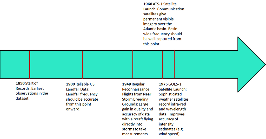
When looking at hurricane frequency trends over time, it’s important to establish any shortcomings in the data collection process that could influence the reliability of our data. The timeline below gives a short overview of some of the key developments in recording hurricane data and their impact on both the accuracy and scope of data capturable.
Fig. 2 Timeline of major developments in hurricane monitoring and measurement
The advent of reconnaissance aircraft flights in the 1940s and satellites becoming more widely employed in the 1960s[4] were both revolutionary developments in terms of improving data quality and reliability[5]. 1949 is often held up as the cut-off point for reliable data, as this is when aircraft measurements became readily available for storms throughout the basin[6].
Tracking Hurricane Frequency
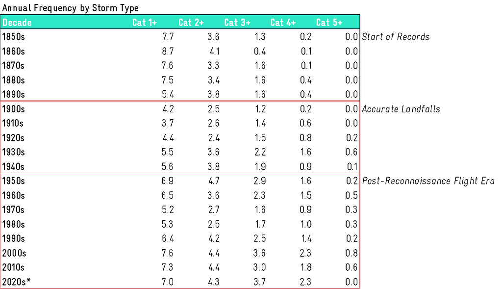
Bearing in mind the limitations we have established around earlier years of data, what does an initial glance at the history of tropical cyclone formation in the basin show us? Figure 3 shows a summary of the number of storms greater than each category we would expect in an average year for any given decade. Note that these figures refer to the number of storms forming in the basin rather than landfalls:
Fig. 3 Summary of average hurricane frequency by decade and intensity in the North Atlantic basin. * 2020s only include two years of observation so is excluded from analysis in Fig. 4
A few observations should be apparent from this decade-by-decade summary:
The effect of potentially unreliable or missing data in earlier years appears to be most noticeable for higher category storms. It seems unlikely that there were no category 5 hurricanes until the 1920s. There are also very few cat 4 storms, even compared to quieter periods of recent history.
We are currently in a relatively active period compared to recent history. However, it’s hard to say if today’s level of activity is “unprecedented” given the apparent under-reporting of higher category storms in the 1800s and early 1900s. There appears to have been a similar or higher level of lower category storms during this earlier period if we do accept the data as reliable.
Aside from the above point around under-reported higher category storms, it is not immediately obvious where measurement improvements have had an impact on potential trends in the data.
There is substantial inter-decadal variation in the period of reliable data.
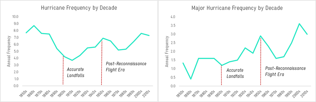
Fig. 4 Summary of temporal trends in frequency for hurricanes (≥ cat 1) and major hurricanes (≥ cat 3)
Looking at these types of trends provides important context of what has actually happened, but on their own aren’t enough to serve as anything more than a Rorschach test for our biases of “why” we have observed these patterns. Depending on who you speak to, this could be evidence of short-term or long-term natural climate oscillations, man-made climate change or something else entirely…
A Potential Source of Short-Term Variability: ENSO
Exhaustively explaining the variation we see in hurricane frequency is well beyond the scope of this post, however as a demonstration of the types of analyses you can conduct with this data, it’s worthwhile to consider sources of potential variability. One of the most well-known of these is the El Niño Southern Oscillation or ENSO (not to be confused with the resident of a small Californian coastal town: “few people know what it's like to be mistaken for a shifting mass of warm water in the Pacific Ocean”[7])
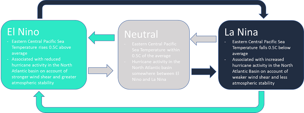
In basic terms, this is a climate phenomenon caused by warming of the Central and Eastern Pacific which has large impacts on global weather patterns and temperatures. There are three distinct phases in this cycle which are referred to as El Niño, La Niña and Neutral. Broadly speaking, in the North Atlantic Basin, El Niño is associated with a less active hurricane season and La Niña with a heavier one. The Neutral phase is somewhere in the middle.
Fig. 5 Summary of the phases in the El Niño Southern Oscillation Cycle
The climate transitions between these phases, with each one generally lasting between 1-2 years and the cycle as a whole taking 5-7 years to play out. Reliable records of the prevailing ENSO phase are available from NOAA going back to 1950[8]. Examining the period from 1950-2021, there have been eighteen El Niño years and nineteen La Niña years, with the remaining thirty-five years being classed as Neutral. How many hurricanes of each category should we expect to see in each phase and does the data match the scientific narrative above?
Fig. 6 Annual Frequency Comparison by ENSO phase. *Phase assigned based on hurricane season average of Nino 3.4 SST anomaly
Fig. 7 Relative difference in hurricane activity by ENSO phase
From a quick look at these charts, we can see that:
Even across the relatively small number of years of data, there is a pretty clear signal of La Niña frequency being substantially higher than the Neutral phase frequency and this, in turn, is substantially higher than El Niño frequency.
The most severe category 5 hurricanes do not fit this trend. These are relatively rare with only 29 recorded in the entire 72-year period. It’s possible that there haven’t been enough years of data to get a meaningful sample here.
What can this trend imply about likely hurricane activity going into 2023? Recent forecasts suggest[9] we could be transitioning into an El Niño phase after a few years of being in La Niña. If this transpires, we should expect a higher-than-average chance of relatively light hurricane season.
Useful, but not the Whole Picture….
Even with fairly simple analyses such as these, we can start to pull interesting patterns out of the IBTrACS data. Although many in the market will be familiar with the impact of ENSO, it’s a good demonstration that short-term climate trends appear to have a notable influence on hurricane frequency, even over the relatively small sample of El Nino/La Nina years in the dataset. It’s worth noting that there are a huge number of other factors that would need to be considered before concrete conclusions could be made, with possible extensions being the examination of the AMO phase[10], sulphate levels and the impact of climate change on historical hurricane frequency.
Additionally, in the current climate especially, history may not be the best predictor of the future. Physics-based models can help in better understanding the complexity and sensitivity of the interactions between all these narratives. They can also help us circumvent the limitations inherent in using a relatively short observational record to examine the types of return period that are of interest to the re/insurance industry.
Whilst no panacea, IBTrACS data is a useful and free tool that anchors us to the tangibility and transparency of the history, whether we are looking into hazard trends or dissecting complex vendor models.